Key Takeaways
- The headline number is not the answer. A "top 10 holders own 62%" figure is meaningless until you know which of those wallets are exchanges, liquidity pools, staking contracts or burn addresses.
- Concentration is a set of measurements, not one number. Top holder share, holder count, the Nakamoto coefficient and the shape of the unlock schedule each describe a different kind of risk.
- Free tools cover most of the work. A block explorer, a bubble map and an unlock calendar will answer the question for the majority of tokens in under fifteen minutes.
Why token ownership concentration matters
Every token has a supply, and that supply sits in wallets. How those wallets are spread out tells you something concrete about the token: who can move the price, who can win a governance vote, and how much supply could reach the market if a small group decided to sell.
Concentration is not automatically bad. A newly launched project will often show high concentration because the treasury, the vesting contracts and the liquidity pool have not distributed yet. A very old token can show high concentration simply because a large exchange custodies coins for millions of users in one wallet. The skill is not spotting a big number. It is working out what the big number is made of.
This guide is educational. It explains how to gather and read the data. It does not tell you what to buy or sell.
What "concentration" actually measures
Several different metrics get called "concentration". They answer different questions.
| Metric | What it tells you | Typical use |
|---|---|---|
| Top 1 holder share | Percentage of supply in the single largest wallet | Fast sanity check |
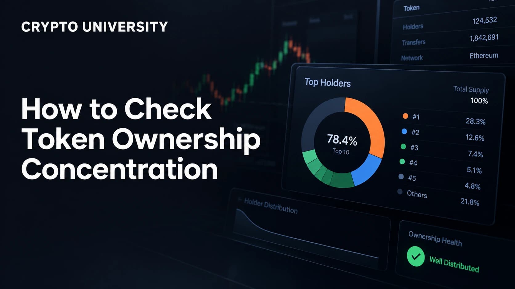
| Top 10 / top 50 / top 100 share | Percentage held by the largest wallets combined | The most common screening number |
| Holder count | How many addresses hold any balance | Rough reach, easy to fake |
| Nakamoto coefficient | The smallest number of wallets that together control more than 50% of supply | Governance and control risk |
| Herfindahl-Hirschman Index (HHI) | Sum of each holder's squared share, so large holders count much more | Comparing tokens on a single scale |
| Gini coefficient | Inequality across all holders, from 0 (equal) to 1 (one wallet owns everything) | Academic and reporting use |
Two practical notes. First, holder count is the weakest signal, because creating thousands of addresses is cheap and some launches deliberately split supply across many wallets to look distributed. Second, almost every token scores as "concentrated" on Gini, so the number is more useful for tracking change over time than for judging a token in isolation.
Step by step: how to check a token's concentration
Step 1: get the correct contract or mint address
Copy the address from the project's own documentation, or from a listing page such as CoinGecko or CoinMarketCap, and confirm the chain. Scam tokens copy names and symbols, so the address is the only reliable identifier. If the token exists on several chains, check each one separately, because supply is split across them.
Step 2: open the holder list on a block explorer
Paste the address into the explorer for that chain, for example Etherscan for Ethereum, BscScan for BNB Chain, Basescan for Base, or Solscan for Solana. Open the "Holders" tab. You will see ranked addresses, balances and percentage of supply, plus a total holder count.
Note that the free web interface usually shows this data fine, while programmatic access to full holder lists is often a paid API feature. Etherscan's holder list and top holder endpoints, for example, sit behind its paid API tiers.
Step 3: label the top wallets
This is the step most people skip, and it is the one that decides whether your number means anything. Click into each of the top 20 addresses and work out what it is. Explorers often label known entities directly. Where they do not, the transaction pattern usually gives it away.
| Wallet type | How to spot it | Counts as concentration? |
|---|---|---|
| Centralized exchange | Public label, huge number of small deposits and withdrawals | No, it represents many users, but it is custodial risk |
| Liquidity pool contract | Labelled as a pair or pool, holds two assets, constant swap traffic | No, this is tradable depth |
| Staking or vault contract | Verified contract, deposits from many addresses | No, but check who controls the contract |
| Bridge contract | Labelled bridge, mirrors supply on another chain | No, it is supply held elsewhere |
| Burn address | Ends in a long run of zeros or is labelled null | No, that supply is gone |
| Vesting or lockup contract | Verified contract with release logic, scheduled outflows | Yes, but on a timetable |
| Treasury or foundation multisig | Labelled, or a Safe contract with several signers | Yes, with governance controls |
| Unlabelled personal wallet | No label, few large transfers, funded from the deployer | Yes, this is the number that matters |
Step 4: recalculate
Add up only the wallets that represent a single owner with discretion to sell. That adjusted figure, sometimes called non-exchange or insider concentration, is the honest version of the "top 10" statistic. It is common for a scary looking 70% to shrink to 20% once exchanges and pools are removed, and equally common for a comfortable looking 35% to stay at 35% because every one of those wallets is a private holder.
Step 5: look for clusters
Splitting a large holding across fifty wallets defeats a simple ranked list. Cluster visualisation tools solve this by drawing holders as bubbles and linking wallets that have transferred to each other, which makes coordinated groups visible at a glance. Bubblemaps is the best known example, and it plots the largest holders as connected bubbles where dense links between wallets are the pattern worth investigating.
Look for wallets funded by the same source, wallets that received supply in the same block, and clusters connected to the deployer address.
Step 6: check what is locked and what unlocks later
Current concentration is a snapshot. The unlock schedule is the forecast. Check a vesting dashboard such as Token Unlocks, DropsTab or CryptoRank, then verify against the project's own documentation and the on-chain vesting contract.
Two questions matter most. How large is the next unlock as a share of circulating supply, and how large is it compared with average daily trading volume. As a rough guide used by analysts, unlocks below roughly one percent of circulating supply are usually treated as background noise, while unlocks above about five percent get attention. Treat these as conventions, not rules.
Step 7: compare concentration with liquidity
A wallet holding 5% of supply is a very different proposition on a token with deep liquidity than on one with a thin pool. Check pool depth on DEX Screener or DEXTools and ask a simple question: if the largest private holder sold, what fraction of the available liquidity would that represent? Concentration only becomes market risk when it is large relative to the exit.
Tools worth knowing
| Tool | Best for | Cost |
|---|---|---|
| Etherscan, BscScan, Basescan, Solscan | Raw holder lists and wallet labels | Free web, paid API |
| Bubblemaps | Visual clusters and connected wallets | Free tier, paid pro |
| RugCheck, GoPlus, Token Sniffer | Automated risk scans including holder share | Free |
| Arkham, Nansen | Entity labelling and wallet identification | Free tier, paid |
| Dune Analytics | Custom holder and distribution queries | Free tier |
| Token Unlocks, DropsTab, CryptoRank | Vesting and unlock schedules | Free tier |
| DEX Screener, DEXTools | Liquidity depth and pool ownership | Free |
How to read your result
There is no official threshold that separates safe from unsafe. What follows are reference points commonly used by analysts, not a scoring system and not advice.
| Adjusted top 10 share (excluding exchanges, pools and burns) | Common interpretation |
|---|---|
| Under 15% | Widely distributed for a crypto asset |
| 15% to 30% | Normal for many mid-sized projects |
| 30% to 50% | Meaningful concentration, worth understanding who holds it |
| Over 50% | A small group can control supply and governance outcomes |
Always read the number alongside three pieces of context: the age of the token, whether the large holders are disclosed and accountable, and whether concentration is rising or falling over time. A young project moving from 80% to 40% over a year is telling a different story from a mature project moving from 20% to 45%.
Common mistakes
- Counting exchange wallets as whales. This is the single most common error and it inflates almost every headline concentration statistic.
- Trusting holder count. Thousands of holders can be a handful of people.
- Using total supply when circulating supply is the relevant base, or the reverse. Say which one you used.
- Ignoring multi-chain supply. One chain's holder list is a partial view.
- Treating a risk score as a verdict. Automated scanners flag patterns, and new legitimate projects often trip the same flags as bad ones.
The limits of this analysis
On-chain data shows addresses, not people. One person can hold fifty wallets, and one wallet can hold assets for fifty thousand people. Off-chain agreements, over the counter deals and custodial arrangements are invisible. Concentration analysis narrows uncertainty, it does not remove it. Use it as one input among several, alongside the project's documentation, its governance record and its disclosed allocations.
FAQ
What is a good percentage for top 10 holders? There is no official standard. Many analysts start paying closer attention when the top 10 non-exchange wallets hold more than about 30% of circulating supply, but a young project with locked treasury allocations can legitimately sit far above that.
Do exchange wallets count as concentration? Not in the ownership sense, because those balances belong to many individual users. They do represent custodial and platform risk, which is a separate consideration.
How do I check concentration on Solana? Use Solscan or Birdeye for the holder list, then a scanner such as RugCheck for an automated view that includes top holder shares, mint and freeze authority status, and liquidity lock information.
Can concentration data be manipulated? Yes. Supply can be split across many wallets to make distribution look broad, which is why cluster maps and funding-source analysis matter more than a ranked list alone.
Is high concentration always a red flag? No. Locked treasury allocations, staking contracts and vesting wallets all show up as large holders. What matters is who controls those wallets, whether the control is disclosed, and when the supply becomes transferable.
Related terms
- Whale: a wallet holding a large enough share of supply to influence the market.
- Nakamoto coefficient: the minimum number of entities needed to control more than half of a network or supply.
- Vesting contract: a smart contract that releases allocated tokens on a fixed schedule.
- Circulating supply: the portion of total supply that is currently transferable.
- Sybil distribution: splitting one holding across many addresses to appear decentralised.
Sources
- Etherscan API documentation, token holder list and top token holders endpoints
- Bubblemaps, guide to reading on-chain holder data
- GoldRush documentation, measuring token holder concentration with Gini and HHI
- InsightX documentation, holder distribution metrics including Nakamoto coefficient
- DEXTools tutorial, checking token holder distribution ## Further reading
- Crypto.news, what a token unlock is and how vesting schedules work
- Solana Compass, how RugCheck analyses holder distribution and authorities
- Webacy documentation, holder concentration index for stablecoins and real world asset tokens
This article is educational and factual. It is not financial advice and contains no price predictions. Figures cited from third party tools are point in time estimates that change continuously.
Not sure which problem you have?
Use the Fixing Crypto Mistakes hub to identify the transaction, wallet, network, or exchange issue before taking another action.
OPEN TROUBLESHOOTING HUB