
Key Takeaways
The dot plot is a survey, not a schedule. Each dot is one policymaker's private view of where the policy rate should be at year end. The Federal Reserve does not vote on the dots and is not bound by them.
The median gets the headline, but the spread and the change carry the information. How far apart the dots sit, and how far the median moved since the previous release, tell you more than the median alone.
Always read the dots next to market pricing. Federal funds futures and prediction markets produce their own implied odds. When those numbers and the dots disagree, the gap is the story worth understanding.
Why This Guide Exists
The Federal Open Market Committee meets on September 15 and 16, 2026. The rate decision arrives at 2:00 p.m. ET on September 16, and because this is one of four projection meetings each year, an updated dot plot lands at the same moment.
Within minutes, the internet will fill with confident claims about what the chart means for markets. Most skip the part that matters: how to read the document yourself. This guide teaches that skill. It does not forecast the decision or what any asset will do afterward.
What the Summary of Economic Projections Is
The dot plot does not exist on its own. It is one figure inside a larger document called the Summary of Economic Projections, usually shortened to SEP.
The Federal Reserve publishes the SEP four times a year, at the March, June, September, and December meetings, alongside the policy statement.
What the SEP contains | Why it matters |
|---|---|
Real GDP growth projections | Shows how strong officials expect the economy to be |
Unemployment rate projections | One half of the Fed's legal mandate |
PCE and core PCE inflation projections | The other half of the mandate, measured the way the Fed prefers |
Federal funds rate projections | This is the dot plot, shown as Figure 2 |
Uncertainty and risk assessments | Whether officials see risks tilted up, down, or balanced |
Up to 19 people can submit projections: the seven Board governors and the twelve Reserve Bank presidents. Not everyone submits every time. In June 2026, 18 participants submitted, and one of those did not submit a 2028 projection.
That detail matters. Only 12 of those 19 people vote on rates at any given meeting, so the dot plot includes opinions from officials who have no vote that day.
Anatomy of the Dot Chart
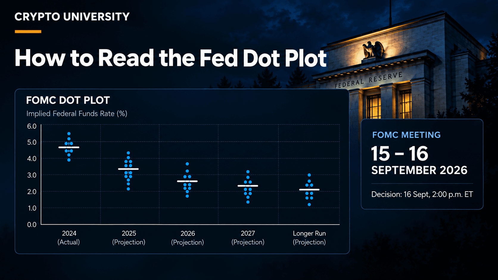
Open the SEP PDF and go to Figure 2. Here is what you are looking at.
The horizontal axis lists the current year, the next two years, and a column called "longer run."
The vertical axis is the federal funds rate in percent.
Each shaded circle is one participant's judgment of the appropriate midpoint of the target range at the end of that year, rounded to the nearest one eighth of a percentage point.
The dots are anonymous. Nobody is named. Attributions you see online are inference, not data.
The "longer run" column is not a forecast of any particular year. It is each person's estimate of where rates settle once the economy is stable, often described as the neutral rate.
One phrase in the SEP does the heavy lifting: participants submit their assessment of appropriate monetary policy. That is not a prediction of what the committee will do. It is what each person thinks the committee should do, under their own assumptions about the economy.
Median Versus Dispersion
Three statistics appear in the SEP table, and they answer different questions.
Statistic | Definition | What it tells you |
|---|---|---|
Median | The middle projection when all are sorted | The headline number reporters quote |
Central tendency | Excludes the three highest and three lowest | Where the bulk of the committee sits |
Range | Every projection, lowest to highest | How much genuine disagreement exists |
The June 2026 release is a clean example. The median projection for the federal funds rate at the end of 2026 was 3.8 percent. The central tendency ran from 3.6 to 4.1 percent. The full range ran from 3.4 to 4.4 percent.
A one percentage point spread across a committee of 18 is not a consensus. Reported breakdowns of that chart described eight dots sitting at roughly the current midpoint, one below it, and nine above it. A median can look decisive while the underlying distribution is split almost down the middle.
Compare the New Release to the Last One
A single dot plot is a photograph. Two dot plots are a direction. This is the comparison most readers skip.
Here is what changed between March 2026 and June 2026, using the medians published by the Federal Reserve.
Median projection | March 2026 | June 2026 | Direction |
|---|---|---|---|
Federal funds rate, end 2026 | 3.4% | 3.8% | Higher |
Federal funds rate, end 2027 | 3.1% | 3.6% | Higher |
Federal funds rate, end 2028 | 3.1% | 3.4% | Higher |
Longer run federal funds rate | 3.1% | 3.1% | Unchanged |
PCE inflation, 2026 | 2.7% | 3.6% | Higher |
Core PCE inflation, 2026 | 2.7% | 3.3% | Higher |
Real GDP growth, 2026 | 2.4% | 2.2% | Lower |
Unemployment rate, 2026 | 4.4% | 4.3% | Lower |
Now apply the one piece of context that makes the table readable. The target range has been 3.50 to 3.75 percent since December 2025, so the midpoint is about 3.625 percent.
In March, a median of 3.4 percent sat below that midpoint, which implied a cut. In June, a median of 3.8 percent sat above it, which implied a hike. The level moved by 0.4 percentage points, but the meaning flipped completely. That is why you compare releases instead of reading one in isolation.
Read Market Pricing Alongside the Dots
The dots are what officials think. Market-implied odds are what traders are paying for. They are separate sources of information.
CME FedWatch converts prices in 30 day federal funds futures into probabilities for each meeting outcome. Prediction markets such as Kalshi and Polymarket run parallel markets on the same question and usually land on slightly different numbers, because they involve different participants and different contract structures.
Market pricing for the September 2026 decision moved a great deal over a few weeks, which is itself a useful lesson.
Approximate date | Reported odds of a 25 bp hike | What moved it |
|---|---|---|
Early August 2026 | Around 40% | Weak July jobs report |
Late August 2026 | Around 56% | Chair Warsh's Jackson Hole remarks |
Early September 2026 | Around 60% to 70% | Solid August payrolls |
September 10, 2026 | Around 72% | Positioning ahead of CPI |
September 11, 2026 | Around 86% to 90% | August core CPI above consensus |
These are widely reported snapshots from CME FedWatch and prediction markets, not official figures, and they change continuously.
Two rules keep this honest. First, an implied probability is not a forecast of the dot plot; it prices the rate decision. Second, a number near 50 percent means the market does not know, and neither do you.
Why the Dots Are a Projection, Not a Commitment
The clearest case in recent history is December 2021.
At that meeting, the median dot for the end of 2022 was 0.9 percent, and the full range across all participants ran from 0.4 to 1.1 percent. Not a single official projected anything above 1.1 percent.
The federal funds target range at the end of 2022 was 4.25 to 4.50 percent, a midpoint of roughly 4.375 percent. The outcome landed more than three percentage points above the highest dot on the chart.
Nobody lied. Inflation behaved differently than expected, and policy adjusted. That is exactly what the SEP says will happen: projections are conditional on each participant's assumptions, and when conditions change, assessments change.
The Fed publishes the error bars itself. In the June 2026 SEP, the historical projection error range for short term interest rates was plus or minus 0.7 percentage points for the current year and plus or minus 2.3 percentage points three years out.
Three Common Misreadings
1. Treating the median as a decision. The committee never votes on the dots. It votes on the target range for one meeting at a time. A median implying two hikes is a summary of opinion, not a plan.
2. Reading the level instead of the change. A 3.8 percent median tells you almost nothing until you compare it to the current midpoint and to the previous release. Direction beats level.
3. Assuming a fixed market reaction. Commentary often states that a hawkish dot plot must push risk assets down. Reality is messier, because markets price expectations in advance. What tends to move prices is the gap between what was expected and what arrived, and that gap is not knowable beforehand. Crypto University does not publish price predictions, and neither should your read of a chart.
A Five Step Routine for Release Day
Open the primary source. Go to the Federal Reserve monetary policy page and download the SEP PDF. Do not rely on a screenshot in a social post.
Find the median in Table 1. Look at the row labelled federal funds rate and read the current year first.
Compare it to the current target midpoint. Above the midpoint implies tightening. Below implies easing.
Check the dispersion. Read the central tendency and the range in the same row. A wide range means a divided committee.
Compare to the previous release. The March and June figures are printed directly beneath the current ones in the same table, which makes this a thirty second check.
Then, and only then, look at market pricing to see how the two views line up.
Why Crypto Readers Follow This Chart
Interest rate expectations feed into the dollar, into real yields, and into how much investors are willing to pay for assets that produce no cash flow. Bitcoin and other digital assets sit in that second category, so the rate backdrop is part of their environment.
That is a statement about context, not causation. Reporting through 2026 has repeatedly noted that Treasury yields responded clearly to Fed repricing while crypto's response was harder to pin down. Treat the dot plot as one input into understanding conditions, not as a trading signal.
FAQ
What is the Fed dot plot in simple terms?
It is a chart where each dot represents one Federal Reserve policymaker's view of where the federal funds rate should be at the end of a given year. It is published four times a year inside the Summary of Economic Projections.
How often is the dot plot released?
Four times a year, at the March, June, September, and December FOMC meetings. The other four meetings in a normal year do not include one.
Does the dot plot tell you what the Fed will do?
No. It shows what individual participants currently consider appropriate under their own assumptions. The committee votes separately, one meeting at a time, and outcomes have diverged sharply from the dots before.
What is the difference between the dot plot and CME FedWatch?
The dot plot reflects policymakers' views and is published by the Federal Reserve. FedWatch reflects trader positioning and is derived from federal funds futures prices. One is opinion from inside the institution; the other is money placed outside it.
What does the longer run dot mean?
It is each participant's estimate of where the federal funds rate would settle over time under normal conditions, often called the neutral rate. It is not attached to any specific calendar year.
Related Terms
Federal funds rate: the overnight rate banks charge each other, and the Fed's main policy lever.
FOMC: the Federal Open Market Committee, the twelve voting members who set US monetary policy.
Core PCE inflation: the Fed's preferred inflation measure, excluding food and energy.
Basis point: one hundredth of a percentage point. A 25 basis point move is 0.25 percent.
Neutral rate: the theoretical rate that neither stimulates nor restrains the economy.
Sources
Federal Reserve Board, Summary of Economic Projections, June 17, 2026. federalreserve.gov/monetarypolicy/files/fomcprojtabl20260617.pdf
Federal Reserve Board, Summary of Economic Projections, December 15, 2021. federalreserve.gov/monetarypolicy/files/fomcprojtabl20211215.pdf
Federal Reserve Board, FOMC calendars and meeting materials. federalreserve.gov/monetarypolicy/fomccalendars.htm
Federal Reserve Bank of St. Louis, FRED Blog, "FOMC Summary of Economic Projections, June 2026," June 22, 2026.
CNBC, "Odds the Fed hikes in September tumble following big July jobs miss," August 7, 2026.
CBS News, "Fed rate hike in September is all but guaranteed after CPI report, economists say," September 11, 2026.
CME Group FedWatch Tool, market-implied probabilities as reported by CNBC, Reuters, Forbes, and Kalshi through August and September 2026.
Editorial note: This article is educational content. It is not investment, financial, legal, or tax advice, and it contains no price predictions. Market pricing figures cited above are widely reported estimates that change continuously. Verify current values at the source before relying on them. Figures are accurate as of September 14, 2026 and are sourced to the Federal Reserve and mainstream financial reporting.
Further Reading
Crypto University: September 2026 Macro and Crypto Calendar. Every dated event this month and when it lands.
A quick overview of deeper detail on EU MiCA License Tracker