Key Takeaways
Liquidation heatmaps and funding rates are context tools, not crystal balls. They show you where pressure is building, but they cannot promise where price will go next.
Your clearest reads come from combining signals. A heatmap alone is weak, but a heatmap read alongside open interest, funding, and chart structure becomes genuinely useful.
Watch crowded positioning, not wishful targets. The real edge is spotting where leverage may be forced to unwind, not guessing where price 'wants' to travel.
If you have ever opened a crypto derivatives dashboard for the first time, you already know how overwhelming it feels. Heatmaps glow with colored bands, funding rates flip between positive and negative, open interest climbs and falls, and somewhere on social media a trader is insisting that every cluster is a guaranteed squeeze. It is a lot of noise, and it pushes most beginners toward one of two extremes: ignoring these tools completely, or trusting them far too much.
The truth sits comfortably in the middle.
Liquidation heatmaps and funding rates are genuinely helpful, not because they predict the future, but because they show you how other traders are positioned. They reveal where leverage is piling up, which side of the market is paying to stay in a trade, and where a forced unwind could turn a calm move into a violent one.
This guide walks you through it step by step: how liquidation heatmaps actually work, what funding rates measure, why open interest and long-short ratios matter, how perpetual futures mechanics shape the data, and five common setups that can hint at a squeeze. By the end, you will read these tools with real context instead of chasing every flashing light on the screen.
What Is a Crypto Liquidation Heatmap?
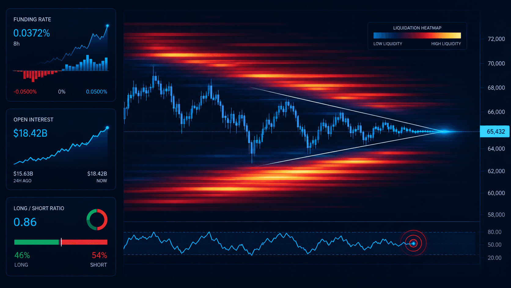
A liquidation heatmap is a visual estimate of where leveraged positions might be forced to close if price reaches certain levels. It is usually built from derivatives positioning models combined with exchange data, and its job is to highlight the zones where a move up or down could set off a chain of liquidations.
In plain language, a heatmap tries to answer one simple question: if price moves into the wrong area, where might too many traders get forced out all at once? That matters because forced selling or buying can turn an ordinary, gentle move into a fast and messy one.
What a Heatmap Does and Does Not Show
What it helps with
Spotting zones where leverage looks crowded.
Identifying likely stress points above or below the current price.
Understanding where a squeeze could accelerate quickly.
Adding context to a breakout or breakdown setup you are already watching.
What it does not guarantee
The exact path price will take.
Precise, real-time liquidation totals.
Any certainty that price must visit a highlighted zone.
A complete picture of every risk in the market.
Heatmap Reality Check
Here is a quick way to keep your interpretation honest:
What you see | A reasonable read | An unreliable read |
A crowded position zone | Price may react sharply if it gets there | Price must go there next |
A large cluster above price | Short squeeze risk exists | A guaranteed pump target |
A large cluster below price | Long liquidation risk exists | A guaranteed dump target |
Think of a heatmap as a pressure map, not a prophecy. It shows you where stress could build, not where price is destined to travel.
What Are Funding Rates?
Funding rates are small, periodic payments exchanged between long and short traders in perpetual futures markets. Because perpetual contracts never expire the way traditional futures do, exchanges use funding as a gentle tether that helps keep the perpetual price close to the spot price.
The basic idea is easy to remember. When funding is positive, longs usually pay shorts. When funding is negative, shorts usually pay longs. That single detail tells you which side of the market is currently the more aggressive or crowded one.
Why Funding Rates Matter
Funding rates matter because they show you how much traders are willing to pay just to hold a directional position. The more one side pays, the more crowded that side tends to be.
Funding condition | What it often suggests |
Strongly positive funding | Longs are crowded or aggressive |
Mildly positive funding | Normal, healthy bullish positioning |
Strongly negative funding | Shorts are crowded or aggressive |
Near-neutral funding | Positioning is relatively balanced |
One important caution: high funding on its own is not a buy signal or a sell signal. It is a crowding signal, and crowding is something you weigh, not something you trade blindly.
Open Interest Explained Simply
Open interest, usually shortened to OI, is the total value or number of derivatives contracts currently open in the market. In short, it tells you how much leveraged exposure is still active and in play.
Why traders watch open interest
Rising OI can show fresh positions entering the market.
Falling OI can show positions closing out or getting liquidated.
Sharp OI swings near a big price move often signal stress.
Reading Open Interest Alongside Price
Open interest becomes far more meaningful when you read it next to price action:
Price action | Open interest | Possible meaning |
Price rising | OI rising | New longs or active participation entering |
Price falling | OI rising | New shorts entering, or hedging pressure |
Price rising | OI falling | Short covering or general position cleanup |
Price falling | OI falling | Longs closing out or a liquidation unwind |
On its own, OI is neither bullish nor bearish. Its meaning comes from how it moves relative to price and funding.
Long-Short Ratio: Helpful but Easy to Misuse
The long-short ratio tries to show you whether more traders are positioned long or short. It sounds simple, but it can mislead you if you lean on it alone, and here is why.
Different exchanges calculate the ratio differently, so numbers rarely line up.
Position size usually matters far more than the raw count of traders.
Aggressive participants can hedge elsewhere, which hides their true exposure.
The better habit is to treat the long-short ratio as a supporting sentiment clue, something that adds color to a picture, never a standalone signal you trade off by itself.
A Quick Perpetual Futures Refresher
To read heatmaps and funding properly, you need a basic feel for perpetual contracts. Perpetual futures are derivatives that let you take long or short exposure without directly owning the underlying asset. They are popular in crypto because they support leverage, trade around the clock, and are easier to access than many traditional derivatives.
But leverage changes everything. When too many positions stack up on one side of the market, even a small spot move can trigger forced liquidations. That is exactly why derivatives data often matters more in crypto than it does in slower, calmer markets.
How Liquidation Cascades Happen
A liquidation cascade happens when one wave of forced closures pushes price further, which triggers another wave of forced closures, which pushes price again. It feeds on itself, and that is what makes it fast.
How a long cascade unfolds
Too many traders are long with leverage.
Price drops into a liquidation zone.
Some long positions are force-closed.
That forced selling pushes price lower.
More longs get liquidated.
The move accelerates downward.
How a short squeeze unfolds
Too many traders are short with leverage.
Price rises into a liquidation zone.
Shorts are forced to close their positions.
Their forced buying pushes price higher.
More shorts get liquidated.
The move accelerates upward.
This is exactly where heatmaps earn their keep. They help you picture where these chains are most likely to start.
How to Read a Coinglass-Style Heatmap in Practice
Many traders use tools like Coinglass because they make derivatives data much easier to scan at a glance. A reliable reading process usually looks like this:
Step | What to check | Why it matters |
1 | Where the current price sits | Gives you an anchor for nearby risk zones |
2 | How dense the liquidation clusters are | Shows where forced unwinds may build up |
3 | Recent highs, lows, and support levels | Heatmap zones matter most near real chart levels |
4 | The current funding rate | Shows which side is paying to stay in the trade |
5 | The open interest trend | Shows whether leverage is building or clearing out |
6 | Volume and overall trend | Confirms whether price can actually push through |
Work through those steps and you end with a simple judgement: does the market look crowded and fragile, or balanced and stable?
Five Setups That Can Signal a Squeeze
These are not guaranteed trades. They are recognizable patterns where positioning and price action line up in a way that makes a squeeze more likely.
1. A large short cluster above price plus rising spot momentum
If shorts are crowded just above the current price and real spot demand is already improving, a squeeze can build quickly. Watch for positive momentum, stable or rising volume, and shorts that are clearly paying or positioned aggressively.
2. A large long cluster below price with weak support
If price is sitting above a dense long liquidation zone and the support beneath it looks fragile, a breakdown can trigger a cascade. Watch for fading bounce quality, weak volume on every recovery attempt, and open interest that stays elevated while price quietly weakens.
3. Positive funding turning extreme while price stalls
When funding climbs to an extreme and price stops responding upward, the market may simply be too long. Crowded longs that are no longer being rewarded become vulnerable.
4. Negative funding plus a failed breakdown
If shorts are crowded and price repeatedly fails to stay down, a short squeeze becomes more likely. The setup is the shorts being trapped on the wrong side of a level that will not break.
5. A sharp OI rise without clean spot follow-through
When open interest jumps but the spot market does not confirm with real strength, leverage is entering without genuine conviction. That creates a fragile setup where one side can easily get trapped.
Squeeze Setup Reference Card
Setup | Main signal |
Cluster above price plus momentum up | Short squeeze risk |
Cluster below price plus weak support | Long liquidation risk |
Extreme positive funding plus a stall | Overcrowded longs |
Negative funding plus a failed breakdown | Shorts may be trapped |
OI surge without spot strength | Fragile leverage build |
Common Mistakes When Using These Metrics
Most beginner errors come from leaning on one number too hard. Here are the five that cause the most trouble, and what to do instead.
Common mistake | Why it hurts you |
Treating heatmaps like magnets | Price does not always visit the largest cluster, so do not assume it must. |
Ignoring spot market structure | Derivatives pressure matters most when it lines up with real chart levels. |
Using funding without open interest | Funding shows crowding direction; OI shows how much exposure is actually active. You need both. |
Overtrading every cluster | Not every liquidation zone produces a clean, tradable setup. |
Forgetting exchange differences | Metrics vary across venues, so one exchange snapshot is never the whole market. |
Risk Management Still Comes First
Even a good heatmap read can fail, and that is normal. Derivatives context is there to support a trading plan, not to replace one.
If you trade on platforms such as Bybit, OKX, or BTCC, pair these tools with sensible position sizing, a clear stop structure, and a defined level where your trade idea is proven wrong.
For broader chart context, many traders keep TradingView open alongside their derivatives dashboard, so they can combine market structure with positioning data in one workflow.
Final Thoughts
Liquidation heatmaps and funding rates are valuable because they reveal crowding and vulnerability. That, honestly, is their real strength. They will not predict price perfectly, but they help you understand where leverage could make a move faster, sharper, or more unstable than it first appears.
Combine heatmaps with open interest, funding, price structure, and basic risk management, and you will use these tools far better than the traders who simply chase every glowing cluster on the screen.
Frequently Asked Questions
What is a crypto liquidation heatmap?
It is a visual estimate of where leveraged positions may be forced to close if price reaches certain levels.
What does a positive funding rate mean?
It usually means long traders are paying short traders, which often points to bullish crowding.
Is open interest bullish or bearish?
By itself, neither. Its meaning depends on how it changes relative to price and funding.
Are heatmaps reliable trading signals on their own?
No. They work best alongside chart structure, funding, open interest, and volume context.
What causes a liquidation cascade?
A cascade happens when forced closures push price further, triggering even more forced closures in the same direction.
What is the biggest beginner mistake with heatmaps?
Assuming the largest liquidation zone must be hit next. It often is not.
Disclaimer
This content is for educational and informational purposes only and is not financial advice. Nothing here is a recommendation to buy or sell any asset or use any platform. Do your own research and manage your risk.
Privacy Tools for Everyday Crypto Transactions in 2026: ZK Options and Compliance-Friendly Methods
Beginners Guide to Hardware Wallets Ledger vs Trezor vs Coldcard
Gas Fees Explained How Ethereum, Solana, and L2s Handle Transaction Costs
What Is a DAO? Governance Models, Voting Mechanisms, and Their Real-World Limitations
Need deeper training?
Join our structured modules with live examples and expert checklists for effective implementation.
JOIN THE ACADEMY