Cryptocurrency charts are visual tools that display price movements over time. They help beginners understand market behavior without needing to predict future prices. This guide explains every core element in plain language, using tables, step-by-step instructions, and clear examples. By the end, you will know how to open a chart, read it accurately, and avoid common beginner mistakes.
What Are Cryptocurrency Charts and Why Do They Matter?
A cryptocurrency chart shows the historical price of an asset such as Bitcoin or Ethereum across different time periods. Charts help you see patterns in buying and selling pressure. They do not provide financial advice, but they organize data so you can make more informed observations.
Charts appear on every major exchange and analysis platform. They use real market data from trades that have already happened. Beginners often start with price alone, but full chart analysis includes price, volume, and technical tools.
Types of Cryptocurrency Charts
There are three main chart types. Each displays the same data differently.
Chart Type | How It Displays Data | Best For Beginners Because... | Limitations |
Line Chart | Connects closing prices with a single line | Simple and clean; shows overall direction | Hides open, high, and low prices |
Bar Chart | Vertical bars showing open, high, low, close | Shows full price range for each period | Harder to read quickly than candlesticks |
Candlestick Chart | Colored rectangles (candles) with wicks | Most popular; easy to spot patterns at a glance | Requires learning candle anatomy |
Candlestick charts are the standard for most beginners and professionals. The rest of this guide focuses on them.
Anatomy of a Candlestick: Open, High, Low, Close Explained
Every candlestick represents price action during one chosen time period (for example, 1 hour). Here is what each part means:
Body: The thick rectangle. It shows the difference between the opening price and the closing price.
Upper wick (shadow): The thin line above the body. It shows the highest price reached.
Lower wick: The thin line below the body. It shows the lowest price reached.
Color coding is simple and consistent across platforms:
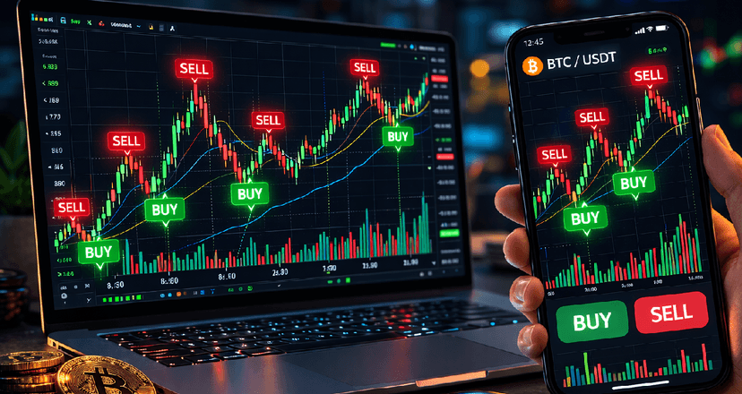
Green (or white) candle: Closing price higher than opening price (buying pressure stronger).
Red (or black) candle: Closing price lower than opening price (selling pressure stronger).
Table: Bullish vs Bearish Candlestick Examples
Candle Type | Body Color | Meaning | Typical Market Signal |
Bullish (Green) | Green | Price closed higher than it opened | Buyers were in control |
Bearish (Red) | Red | Price closed lower than it opened | Sellers were in control |
Doji | Very small or none | Open and close almost the same | Indecision between buyers and sellers |
Hammer | Small body, long lower wick | Price fell sharply but recovered | Possible reversal after downtrend |
Shooting Star | Small body, long upper wick | Price rose sharply but fell back | Possible reversal after uptrend |
Learning to read single candles is the foundation. When many candles form patterns over time, they create stronger signals.
Choosing the Right Timeframe
Timeframes change how much detail you see. A 1-minute chart shows noise; a weekly chart shows the big picture.
Recommended Timeframe Table for Beginners
Timeframe | What It Shows | Best Used For | Risk of Over-Analysis |
1-minute | Very short-term noise | Day trading (experienced users only) | High |
15-minute | Short-term moves | Intraday swings | Medium |
1-hour | Daily trends | Most common starting point | Low |
4-hour | Multi-day trends | Swing trading | Low |
Daily | Overall market direction | Long-term view | Very low |
Weekly | Major cycles | Macro perspective | Very low |
Rule for beginners: Always start with the daily chart, then zoom into the 4-hour or 1-hour chart for detail. Never analyze only one timeframe.
Volume: The Confirmation Tool - Nitros Bull Crypto Indicator
Volume shows how many coins or tokens were traded during each candle. High volume confirms a move is more meaningful.
Rising price + rising volume = stronger uptrend.
Rising price + falling volume = weaker uptrend (possible reversal soon).
Falling price + rising volume = stronger downtrend.
Nitros Bull Crypto Indicator displays volume as vertical bars at the bottom of the chart. Look for volume spikes near important price levels.
Tutorial Video for Nitors Bull Crypto Indicator
Key Technical Indicators Every Beginner Should Know
Technical indicators are mathematical calculations plotted on the chart. They help filter noise. Start with these four; do not overload the screen.
Indicator Summary Table
Indicator | What It Measures | How to Read It | Common Settings | Beginner Tip |
Average price over time | BULL = Buy alert BEAR = Sell alert | 50-day and 200-day | Golden cross (50 above 200) signals strength | |
Relative Strength Index (RSI) | Speed and change of price moves (0-100) | Above 70 = overbought; below 30 = oversold | 14 periods | Divergence with price can warn of reversals |
Moving Average Convergence Divergence (MACD) | Relationship between two moving averages | Histogram above zero line = bullish momentum | 12, 26, 9 | Line crossovers give entry signals |
Bollinger Bands | Volatility around a moving average | Price touching upper band = high volatility | 20-period, 2 standard deviations | Squeeze (bands narrow) often precedes big moves |
Add one indicator at a time. For example, first learn moving averages, then add RSI.
Support and Resistance Levels
Support is a price level where buying interest tends to stop the price from falling further. Resistance is a level where selling interest tends to stop the price from rising.
These levels become stronger when tested multiple times. When price breaks through resistance with high volume, that old resistance often becomes new support.
Draw horizontal lines on your chart at obvious swing highs and lows. Mark them clearly.
Trend Lines and Channels
An uptrend line connects higher lows. A downtrend line connects lower highs. A channel is two parallel trend lines containing price movement.
Break of a trend line with volume often signals a potential change in direction.
Common Chart Patterns
Patterns repeat across assets and timeframes. Here are the most reliable for beginners:
Head and Shoulders (reversal pattern): Left shoulder, head (highest), right shoulder. Break of neckline confirms reversal.
Double Top / Double Bottom: Two peaks or troughs at similar levels. Break confirms reversal.
Triangles (continuation): Price squeezes into a point. Breakout direction usually continues the prior trend.
Flags and Pennants: Short consolidation after strong move. Breakout continues the trend.
Pattern Reliability Table (Based on Historical Observation)
Pattern | Typical Outcome | Volume Confirmation Needed? | Time to Form |
Head and Shoulders | Trend reversal | Yes | 3–6 months (daily) |
Double Bottom | Bullish reversal | Yes | 1–3 months |
Ascending Triangle | Bullish continuation | Yes | 1–2 months |
Bull Flag | Strong continuation | Yes | Days to weeks |
Step-by-Step Guide: How to Read Any Crypto Chart
Follow this exact process every time:
Open the chart on a reliable platform (see tools section below).
Set the timeframe to daily first.
Identify the overall trend (higher highs and higher lows = uptrend).
Mark major support and resistance levels.
Check volume for confirmation on recent moves.
Add only two indicators at first (for example, 50-day MA and RSI).
Look for candlestick patterns or larger chart patterns.
Switch to 4-hour chart for more detail if needed.
Note any news events that might explain unusual moves (check a calendar, do not assume).
Write your observations in a notebook: “Price at support, RSI oversold, volume increasing.”
Repeat this process on several different coins to build pattern recognition.
Popular Charting Tools and Platforms
Tool | Free Tier Available? | Best Feature for Beginners | Mobile App? |
Yes | Clean interface, huge community ideas | Yes | |
CoinMarketCap Charts | Yes | Simple, integrated with price data | Yes |
Binance Chart | Yes | Real-time exchange data | Yes |
CryptoCompare | Yes | Good for multi-asset comparison | No |
TradingView is the recommended starting point because of its education resources and public idea sharing. More reading about Tradingview.
Common Mistakes Beginners Make
Overloading the chart with 10+ indicators (creates confusion).
Ignoring volume.
Using only one timeframe.
Chasing every small candle instead of the bigger picture.
Assuming a pattern guarantees the next move (patterns fail often).
Trading without a written plan.
How to Practice Chart Reading Safely
Use the replay feature on TradingView to practice historical charts without real money.
Pick five major cryptocurrencies and review their daily charts every weekend.
Join free public watchlists on TradingView to compare your analysis with others.
Keep a simple journal: date, asset, observation, what happened next.
Chart reading is a skill that improves with consistent, deliberate practice.
Conclusion
Reading cryptocurrency charts is about organizing information, not predicting the future. Start simple: master candlesticks, timeframes, and one or two indicators. Use the tables and step-by-step process above as your checklist. Over time you will recognize patterns faster and make clearer observations about market structure.
This skill works for Bitcoin, Ethereum, or any other digital asset. Practice daily, stay patient, and treat every chart as a learning opportunity.
FAQ
What is the best chart type for absolute beginners?
Candlestick charts. They combine price information and visual patterns in one easy-to-read format.
How many indicators should I use on my chart?
Start with two. Adding more creates conflicting signals and confusion.
Does chart analysis work for all cryptocurrencies?
Yes. The same principles apply to Bitcoin, Ethereum, and smaller tokens, although liquidity and volatility differ.
Can I read charts on my phone?
Yes. TradingView and Nitros Bull Crypto Indicator offer full charting features on mobile.